6. My Connections and Graphs
The Netsight3 My Connections page gives you access to a Traffic Lights style RAG rated display of the connections belonging to your organisation. In addition you can also view a history of any packet loss incidents and gain access to graph dashboards displaying the status of those circuits.
6.1 Accessing the My Connections page
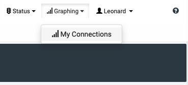
Logged in users will have access to a My Connections page from the Graphing menu.
6.2 The page sections
The My Connections view is split into three sections.
6.2.1 Organisation details
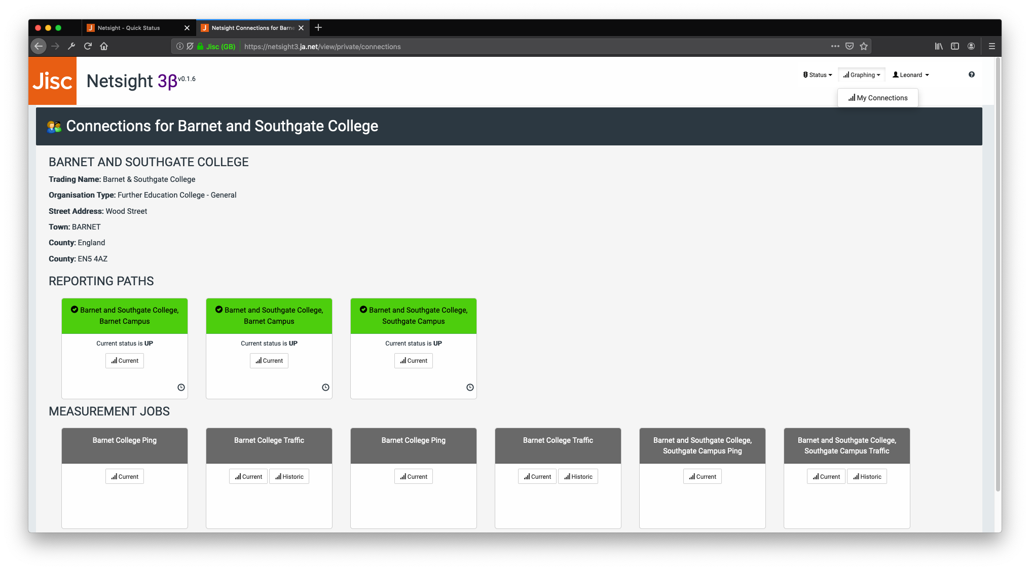
The name and contact details of your organisation are displayed at the top of the page.
If any of these details are incorrect please contact us by emailing help@jisc.ac.uk.
6.2.2 Reporting Paths
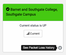
The second section lists Traffic Lights style cards for your organisations circuits (represented on the system as Reporting Paths). These are colour coded using a RAG rating and are marked as Red / Down where packet loss is greater than 90% and Amber / Degraded where packet loss is between 40% and 90%. Where packet loss is less than 40%, cards are marked as Green / Up.
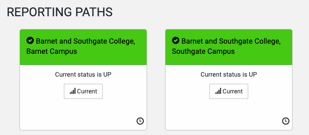
6.2.2.1 View packet loss history
You are able to see the packet loss history (up to the last 30 events recorded where packet loss was above 0%). You can access this by clicking on the small clock icon in the bottom right hand corner of each reporting path card.
This shows up to the last 30 outage records (if there have been 30 or more).
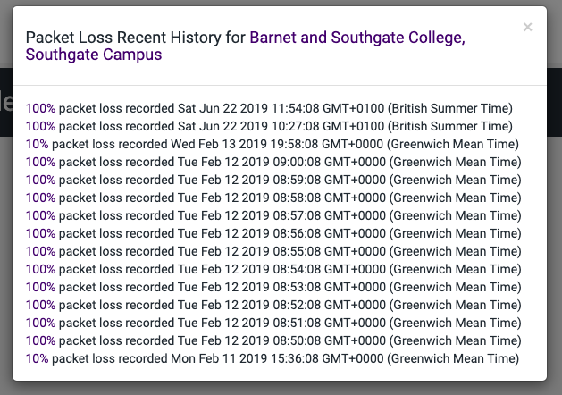
Note that if the circuit is currently experiencing an outage, you will only see records for the past 30 minutes, as the system will be recording one outage event each minute.
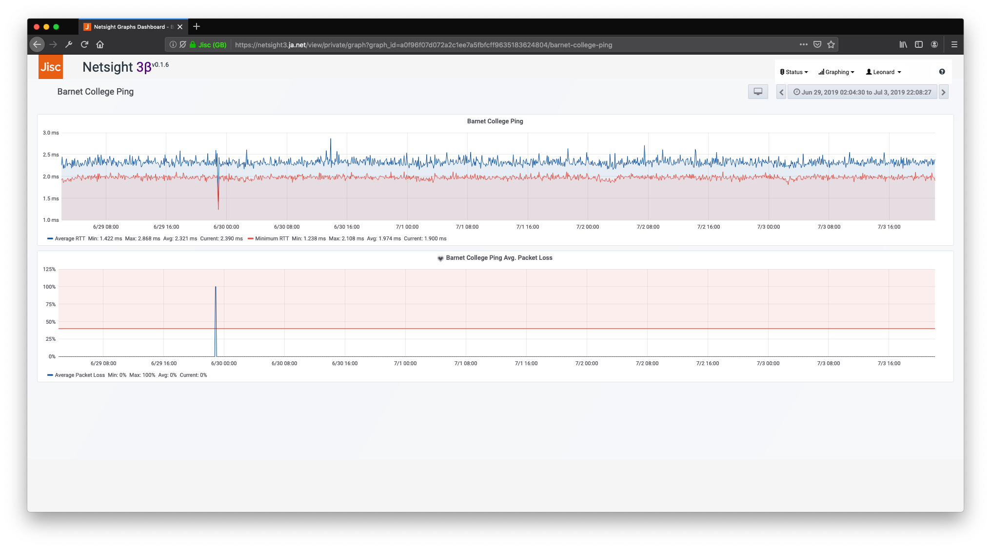
Note that the Ping graph dashboard includes a graph for packet loss which will provide more detail about outages on that circuit. See section 6.2.3.1 below for more details.
6.2.2.2 Accessing the Current Ping and Traffic graphing dashboard
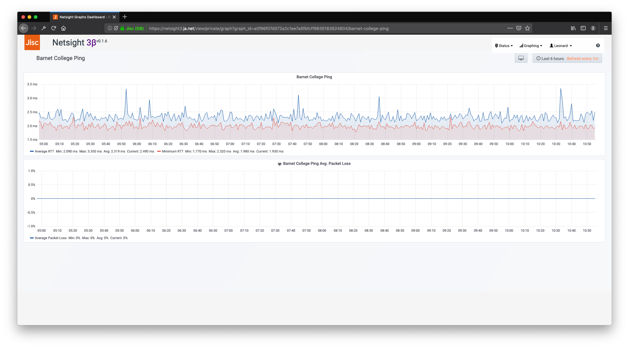
A graphing dashboard is available for each Reporting Path / circuit, and includes graphs for the current ping and traffic data. This can be accessed by clicking on the Current button on the relevant Reporting Path card.
N.B. Data for the Current graphing dashboard is derived from the new Netsight3 pollers. These have only been running for a few months so do not have data going back beyond the start of 2019.
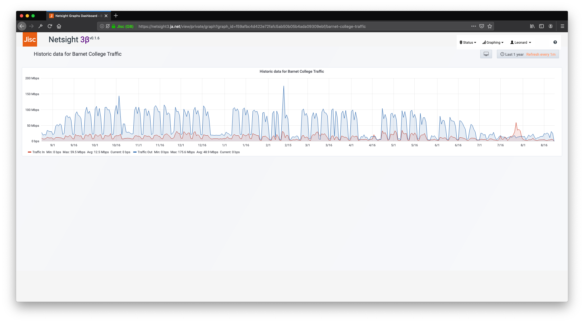
(Access is provided to older, historic traffic data via a separate Historic dashboard which pulls older data from a separate data source. These dashboards can be access from the relevant Traffic measurement job.)
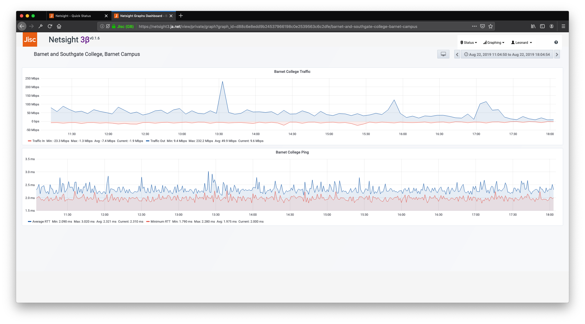
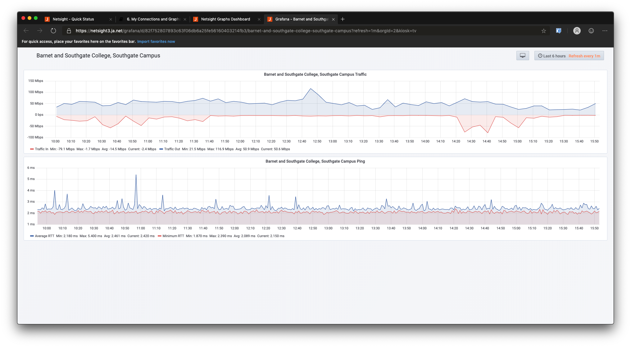
The top graph on the dashboard show 'Traffic In' (in red) and 'Traffic Out' (in blue) for the connection in megabits per second. Traffic data is gathered via SNMP one every five minutes. Note that traffic data is gathered at the Jisc Janet end of each connection. This means that 'Traffic In' equals traffic flow out from the customer organisation back into the network core. 'Traffic Out' is the flow from the Janet core out to customer organisations.
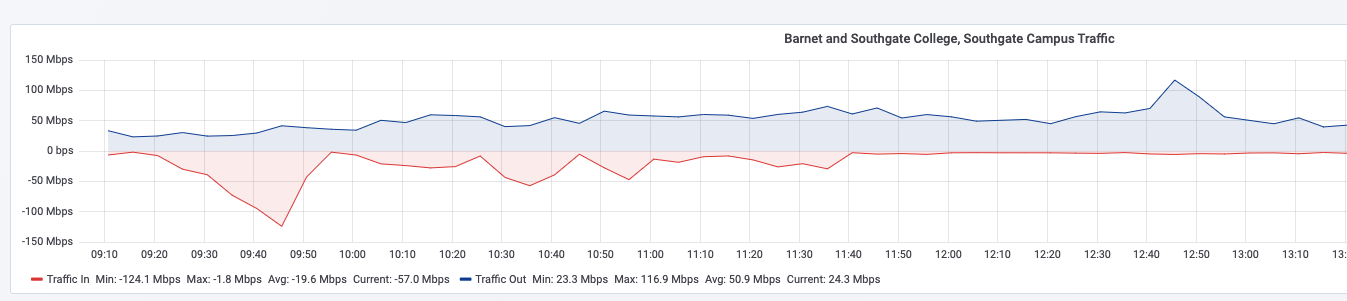
N.B. Please note that the red 'Traffic In' line is shown on a negative Y axis. This is for clarity in the graph display but gives negative values when mousing over the details of the graph. If you want to view the traffic data in and out both on a positive Y axis (where they overlap), you can do this by clicking on the Current button on the relevant measurement job card.
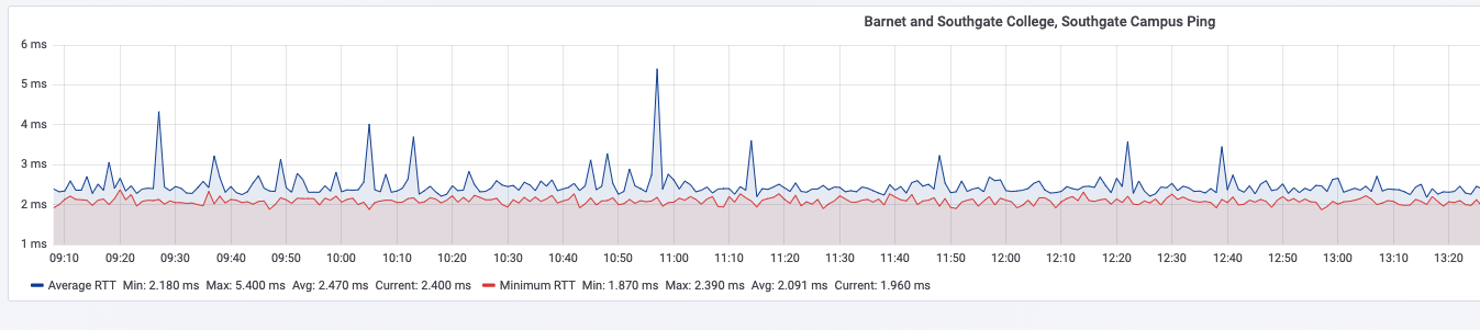
The bottom graph shows average (blue) and minimum (red) Ping round-trip time for the connection in milliseconds. Ping polling is done every minute and ten pings are sent to produce these averages.
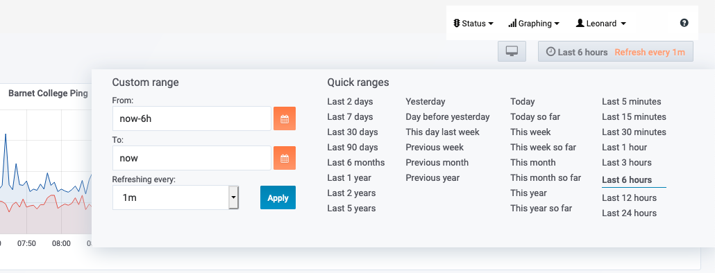
6.2.2.3 Adjusting graph date ranges
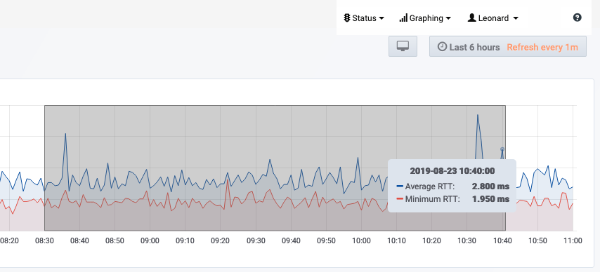
You can change the date range for any graphs on the Netsight3 system either by using the button in the top right of the screen or by clicking, dragging and highlighting a section on the graph itself. This applies to every graph published on Netsight3.
6.2.2.4 Opening the graphing dashboard in a new window
If you wish to open the graph dashboard in a new window without the Netsight3 header and landmark navigation on the screen, you can do so by choosing the Open in New Window option from any graph page.
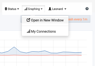
This is useful if you have difficulty scrolling graphing pages on smaller displays.
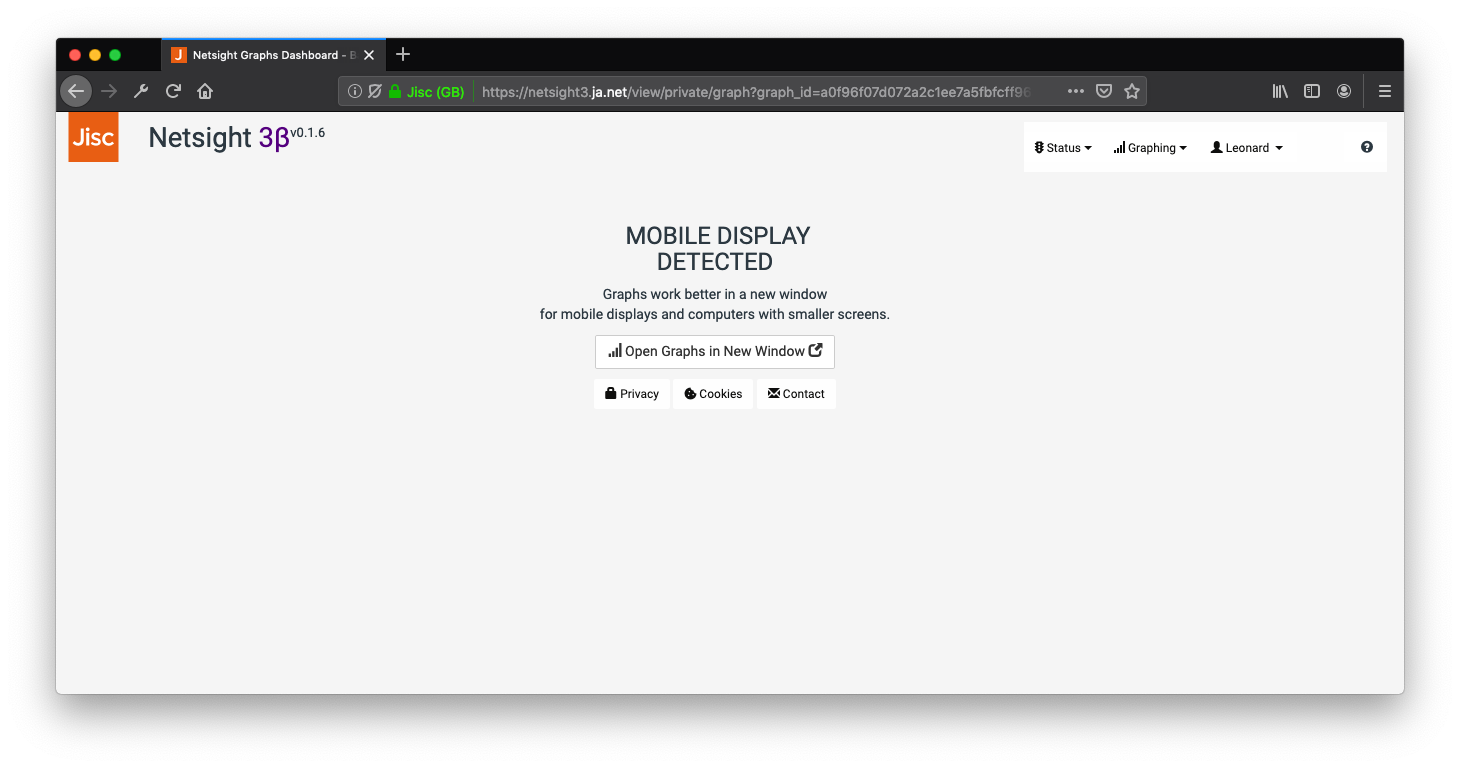
6.2.2.5 Accessing graphs on mobile or display with smaller screens
For users on devices with displays below a certain size, the system will force you to open the graphing screen in a new window to ensure you get a good user experience.
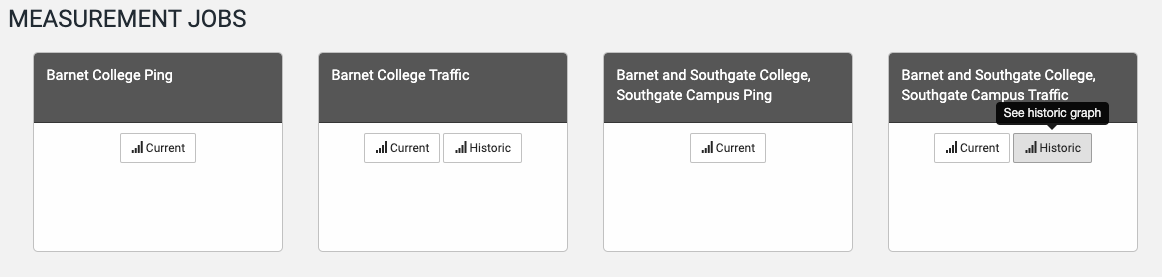
6.2.3 Measurement Jobs
6.2.3.1 Accessing the current Ping Graphing Dashboard from the Ping Measurement Jobs
In addition to the Current Ping and Traffic dashboards that are accessible from the Reporting Path cards, a second Ping dashboard for each circuit is available from the corresponding Measurement Job cards in the Measurement Jobs section of the page.
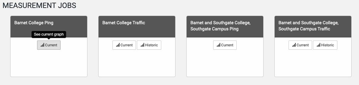
6.2.3.2 Accessing the Current and Historic Traffic Graphing Dashboards from the Traffic Measurement Jobs
In addition to the Current Ping and Traffic dashboards that are accessible from the Reporting Path cards, two other Traffic dashboards for each circuit are available. These are accessed via corresponding Measurement Job cards in the Measurement Jobs section of the page. These give access to dashboards for the Current measurements. (Data for these comes from Netsight3 pollers). Additionally an Historic Traffic dashboard is provided which graphs data back beyond the start of 2019. (This data is drawn from a separate system which has been running longer than Netsight3).
The default time range for Historic graphs is the past year.